
User Manual
Form Template Designer
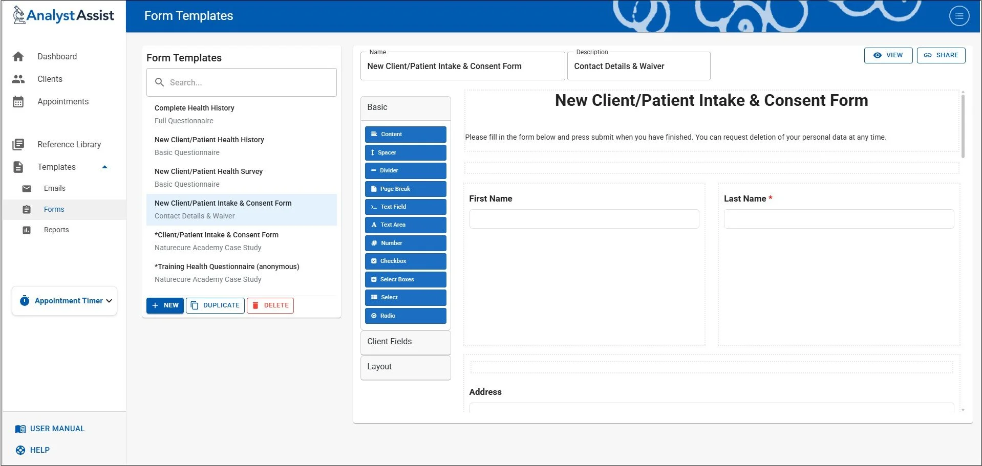
The Form Templates Designer page is where all the Templates for digital Forms that are added to Client/Patient emails in the Compose Email panel (Client Record) are managed - it is possible to add/delete or change all Form templates here.
Please Note: Access to the Admin menu is disabled from the Templates pages for all versions - select the Dashboard before clicking the Admin button.
Digital forms that are sent to Client/Patients can include two types of fillable fields - ‘Client Fields’ which when completed will automatically update the relevant fields in the Clent/Patient record, and standard fields who’s entered values will appear in the pdf that is added to the Client/Patient record on submission. See the ‘Email digital forms’ page of the User Manual for more information.
When the Form Template Designer page is opened, the current list of Form templates in the database are displayed by Name in alphabetical order. By default, a selection of example Templates displaying a range of component options are included. These can be customised, copied or deleted as required.
Please Note:Templates marked with ‘*’ are intended for use by students of the Naturecure Academy Live & Dry Blood Analysis Training Course.
The following options are available:
Open a Template in the Designer - click on any Template in the list to open it in the designer
Search for a Template - add characters in the ‘Search’ panel above to filter the list of Templates. Remove all characters in that field to reset the Template list.
Create a new Template - click the ‘ + NEW ‘ button to start a new Template.
Duplicate - when a Template is selected, click the ‘Duplicate’ button to add a copy of the selected Template to the list.
Delete - when a Template is selected, click the ‘Delete’ button to delete the Template from the database. A confirmation dialog will appear asking you to confirm your decision.
View - when a Template is selected, click the ‘View’ button to open a demonstration version of the Form Fill page that Client/Patients will use when completing the Form.
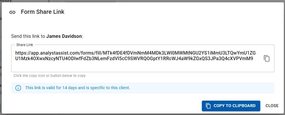
Share - when a Template is selected, click the ‘Share’ button to create a shareable link for any Client/Patient to complete the Form. This happens automatically when you add Forms to an email in the Compose Email panel.
Reset the template list - see below.
Previewing digital forms
When a Template is selected in the designer, it is possible to preview exactly what the Client/Patient will experience by clicking the ‘View’ button.
This will open a new browser tab that displays the digital form and allows you to input data, to see how the form works. Clicking ‘Submit’ will do a data validation check (e.g. ‘required’ fields completed) but will not submit the form. Clicking ‘Cancel’ will close the tab.
Generating shareable form links
Although when a Form Template is selected in the Compose Email panel, a link to the completable form is added to the email, it is also possible to generate form links manually in the Form Template screen.
When a Template is selected, click the ‘Share’ button. This will trigger the opening of the ‘Select Client’ panel (which you can read all about in the Client/Patient Record User Manual page), which allows you to select a specific Client/Patient that the form should be connected to.
When you have selected the Client/Patient Record from the list, click the ‘Select Client’ button and the ‘Form Share Link’ panel will appear. Click the ‘Copy to Clipboard’ button or icon to copy the link to your computer’s clipboard. You can then ‘Close’ the panel or click the ‘Escape’ key (not Macs) to close the panel.
The link can then be pasted into an email or document for the Client/Patient to use.
Please Note: Form links will only stay valid for 14 days
Resetting the Template list
Should you need to reset the Form Template list in your database, delete all the Templates in the list then navigate away from the Form Template Designer page. When you return, the list will have been re-populated with the default list of Form Templates.
Please Note: The default Template list may change over time, and resetting the Template List will permanently remove any user-created or customised Templates.
Creating / Customising Templates
To create a new Form template, click the ‘ + NEW’ button - this will open a blank template screen. To customise an existing Template, select it in the list and the Template will display in the designer. The header options are:
Name - (required) a unique identifier
Description - (optional) additional information as a reminder when used in the Compose Email panel.
When any of the above fields OR the Template design panel are changed in any way, the ‘Save’ and ‘Cancel’ buttons appear. Clicking ‘Save’ permanently updates the Template record in the database, and ‘Cancel’ will revert the template to the previously saved version.
Drag & Drop Template Layout
The Template Designer is a drag & drop WYSWYG editor, meaning that it is a visual representation of the layout of the Template, and you can move the components around to change their order, and even nest components inside certain others.
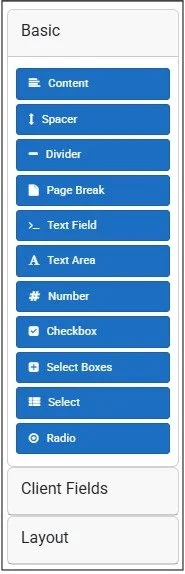
The sidebar on the left includes draggable tabs for all of the components available, organised into groups - Basic, Client Fields & Layout. To open a group panel, click it in the sidebar and the group will open up or collapse (when clicked a second time).
Basic - simple formatting/design components
Content - a configurable component that allows text, images and more (see the ‘Content’ components User Manual page).
Spacer - add an empty line to vertically space your components.
Divider - add a horizontal line for separating sections of the Template.
Text Field - a single-line field with label (can be ‘required’ to be completed).
Text Area - a multi-line field with label (can be ‘required’ to be completed).
Number - a single-line field that will only accept numbers (can be ‘required’).
Checkbox - a single checkbox with a label.
Select Boxes - multi checkboxes with a main label and option labels (can be ‘required’).
Select - a drop-down selector with multiple values (can be ‘required’).
Radio - a multiple radio button control with a main label and option labels (can be ‘required’).
Client Fields - Input fields that will be imported into the relevant Client/Patent Record when the completed form is submitted
First Name
Last Name
Tel No
Date of Birth
Gender
Address
Special Requirements
Layout - Template structural formatting components (all these can have other components nested within them)
Well - a simple outlined panel with a gray background.
Columns - a single-row set of invisible panels (number of cells configurable)
Field Set - a way of grouping components with no format impact on form
Panel - a simple outlined panel with an optional title above it
Table - a multi-row set of invisible panels (number of rows and columns configurable)
Tabs - a multi-tab container
Adding new components
To add a new component to the template designer:
Click and hold the blue component sidebar tab with your left mouse button and drag the component tab to the main Template panel. Release the mouse button to site the component. This can be above or between existing components (which will move to make space), or below the last component in the list. It can also be within a ‘Layout’ component, creating a nested effect.
If the component has configurable settings, the component ‘Edit’ panel will display - make any required changes.
Click the component ‘Save’ button to insert the component, or ‘Cancel’ to return to the Template designer without the new component inserted.
Remember to click the Template master ‘Save’ button to confirm all changes, or ‘Cancel’ to revert to the previously saved version.
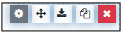
Component hover menu
To manage components already in the Template, move your mouse icon over the template. The component’s hover menu will appear.
To open the component’s edit menu again to make configuration changes (if it has one):
Click the ‘Settings’ icon with your left mouse button. Make any required changes, then click the component ‘Save’ button to confirm the changes, or ‘Cancel’ to revert to the previous configuration.
Remember to click the Template master ‘Save’ button to confirm all changes, or ‘Cancel’ to revert to the previously saved version.
To move a component to a different place in the Template:
Click and hold the ‘Cross’ icon with your left mouse button. Move the mouse and the component will be dragged to the new position with the other components in the Template making space for it.
Release the mouse button to insert the component in its new position.
Remember to click the Template master ‘Save’ button to confirm all changes, or ‘Cancel’ to revert to the previously saved version.
To copy a duplicate of a component to a different position (or even to a different template):
Click the ‘Copy’ icon (twin pages)
All components will now have a ‘Paste’ icon added to their hover menus
Move the mouse to the component ABOVE where you want to insert the copy
Click the ‘Paste’ button in that component’s hover menu and the duplicated component will be inserted below.
Remember to click the Template master ‘Save’ button to confirm all changes, or ‘Cancel’ to revert to the previously saved version.
To remove a component:
Click the red ‘X’ icon to delete the component. If the component has other components nested within it, a dialog will ask if you want to continue and lose the nested components as well.
Remember to click the Template master ‘Save’ button to confirm all changes, or ‘Cancel’ to revert to the previously saved version.